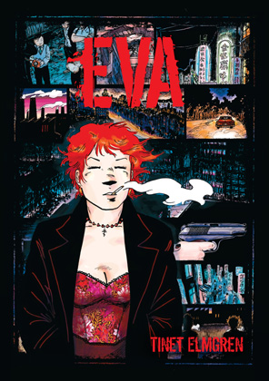
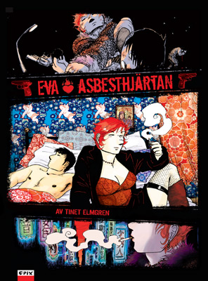
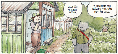
EVA BOOK
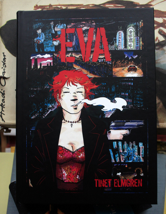
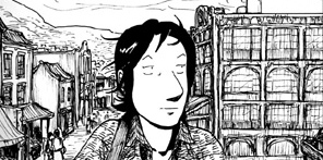
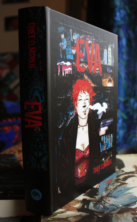
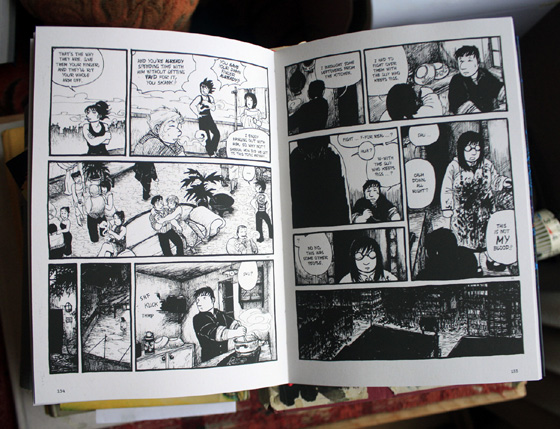
Here it is – the 240 page luxury hardcover book collecting all the hard boiled short stories about Eva’s everyday work and leisure in the black glass streets of her city, splattered with blood and washed with rain. Many of them never before published in English, or only in very crappy English.
The book contains all the Eva stories so far:
- Asphalt Mirrors, Lead Lips, Odd Tuesday, Glass Rain, Flashback! Postman Blues, She’s a Killing Machine, Asbestos Hearts, Electric Tsunamis
… and many sketches and illustrations!
Get your copy in my gumroad store!
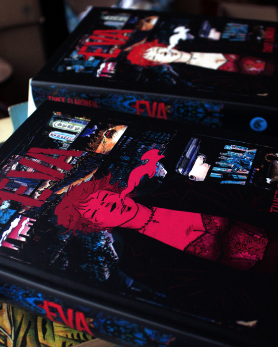
There was plenty of drama with the printing of this book. At first I received a full edition of books with misprinted covers – I’d ordered shiny varnish for parts of the front cover, but the printers had printed the varnish as colour (100% magenta lol).
It turned out they had changed their printing process just when I placed my order, and don’t offer varnish on hardcover books with round spines anymore. That partly explains the misprint, though they should have noticed. They took responsibility for the error and printed a full edition of corrected books free of charge, without arguing, which was very nice of them.
HOWEVER, it means that now I have a huge amount of boxes full of books that I don’t actually have storage space for!
So please help me lol and buy lots of books from me!!! T^T
Especially Eva books and Driftwood books, which take up the most space in my storage and will look absolutely stunning in your book shelf! I’m selling the misprinted Eva copies for extra cheap/”choose your own price”.
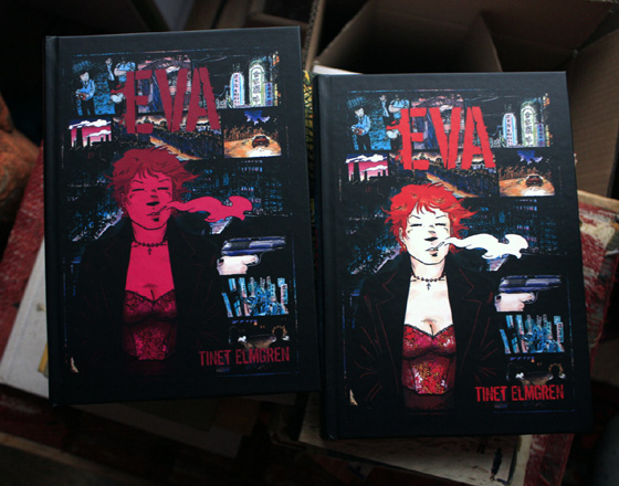
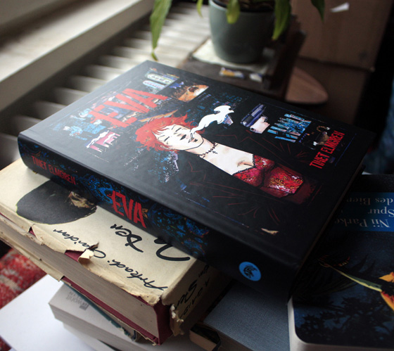
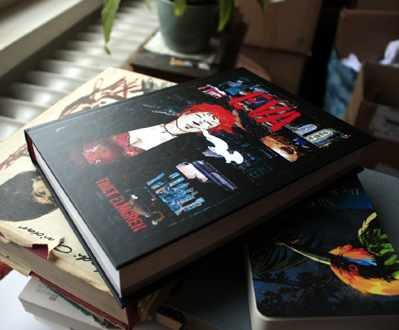
The two versions only have different covers. It’s kind of difficult to capture in photos, but the magenta colour on the cover really is smash bang full on 100% magenta, partly overlaid on red and black.
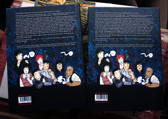
Also, the text on the back cover of the misprinted book is not centered (I was able to fix that thanks to the misprint!).
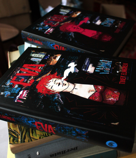
In any case, the books are really beautiful. I’m very happy with the round spine hard covers and the nice thick creamy paper inside. ♥ (So get your copy if you haven’t yet!)
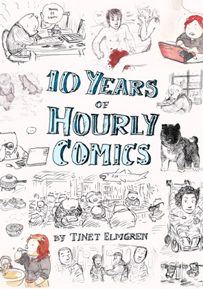
10 Years of Hourly Comics
All my hourly comics from the last ten years collected in one book!
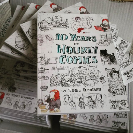
February 1st is Hourly Comic Day – the day when artists draw a comic for every hour that they’re awake. These ten years of hourly comics provide glimpses on evolving art styles, changing relationships, dreams, fantasies, hurt and recovery, doggies, piggies and the mundanities of unglamorous Berlin life – mouldy walls, coal stoves, the m41 bus and all.
108 pages, black&white interior, A5 size.
You can get it at Stockholm International Comics Festival, May5th-6th, or order directly from me (6 € + postage).
How I do watercolours
I used to paint a lot with watercolours as a child and teenager, but then I started to draw comics seriously, and at least in the 90’s and 00’s I had no affordable way of printing full colour comics, so I worked exclusively in black and white for ages.
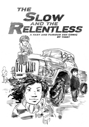
Only two years ago or so I started making forays into watercolour comics, with grey wash (The Slow and the Relentless), lots of little piggy sketches in colour, and my first colour comic (China White). Around that time, the Swedish comics publisher Ordbilder Media made a call for comic book pitches, including the option of an 80 page comic book in full colour. I pitched a watercolour piggy comic. The rest is history …
Here are my tools:
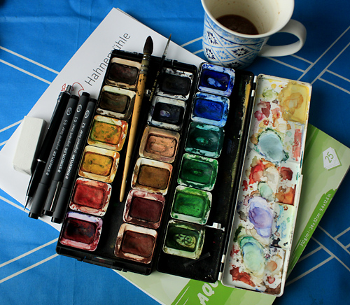
Cheap Hahnemühle watercolour board with a nice grain, Pelikan watercolours from 25 years ago, also 25 year old Raphael “Kazan squirrel hair” brush, size 1 or 2 (I’ve used it for watercolours and ink alike), tiny size “00” brush for the smallest details and cleaning up splotches. Staedtler pigment liners (sizes 0.2, 0.3, 0.5), mechanical pencil HB 0.7, lots of coffee … and finally, a Staedtler mars plastic eraser doing the devil’s work.
Half of the watercolour case and the browns and greens are from a Pelikan watercolour set (like this one) that my friend Nicole and I split in 6th grade, when our class cleaned out the crafts closet in our classroom. I supplemented it back then with blues, reds and yellows.
My process with this comic was as follows: I sketched with pencil on the board. Then I inked it with Staedtler pigment liners (they become waterproof after they’ve dried).
Then I committed the horrific act of erasing the pencil from underneath the ink. It does kind of ruin the surface to use eraser. But not enough for me to care, I guess.
Finally, I coloured with the watercolours.
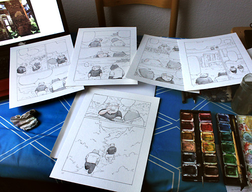
I often did certain parts of the colouring in batches of 4-6 pages, to save time and to make the colour consistent in the parts that should be consistently of the same colour in one scene, like their skins and hair and some of their clothes. This should not be overdone, though, since each page is an entity that must harmonize within itself.
For the yellow morning light I started with a light yellow wash on the whole panel.
Before you’ve acquired truly mad skills, it’s usually best to use a somewhat limited colour palette for each scene, with two base colours and one or two accent colours. Above: brown/teal//light green/greyish blue.
Below (in the flashback): pink/grey//gold
Green is a pain in the arse and difficult to make look bearable. This comic is set in the summer, in the countryside, so it has a lot of greens … For greens in nature I used blue-greens and yellow-brown-greens.
For the man-made swine-made structures, by contrast, I used more “straight-up” greens, to accentuate their artificiality.
(Light green, turquoise and brown are popular colours for village houses in Tatarstan and Bashkortostan!)
My favourite advice on watercolours from Hayao Miyazaki: Use transparent, not sticky, paint; paint another layer after the first has dried.
My favourite advice from Joann Sfar (in one of the Klezmer afterwords): Use “unnatural” colours.
My own advice to myself: Don’t overwork the colouring with too much detail, and let the paper (or base wash) show here and there. With watercolours the most beautiful thing is the natural surface of simple strokes and washes. And keep some tissue/toilet paper handy. You will need it.
Finally, here is a video of me colouring one page in this book. It’s sped-up (obviously) – in reality it took me 35 minutes.
Akvarellfärgläggning: Tinet Elmgren / “Sockerärter” from Tinet Elmgren on Vimeo.
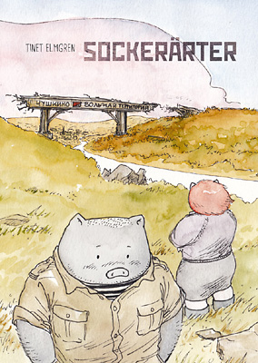
Sockerärter (“Sweet Peas”) will be released by Ordbilder Media at Stockholm International Comics festival, May 7th-8th 2016! I will be there to sign it and talk about it.
Embarking on a piggy project
I’m making a little piggy book for the Swedish publisher Ordbilder. They called for pitches last summer, and now I found out that from all the book proposals they got, they chose mine. It will be published next year in time for the book fair in Gothenburg.
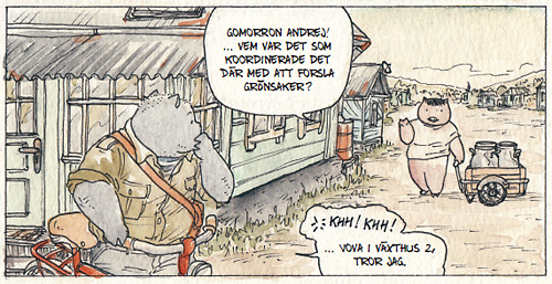
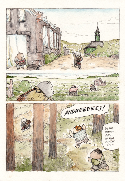
This is one of the sample pages I submitted (the only one without spoilers):
The book doesn’t have a proper title yet. The English working title was Sweet Peas, but it doesn’t really work in Swedish, and I hate puns anyway. V^(oo)^V
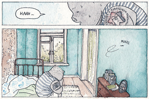
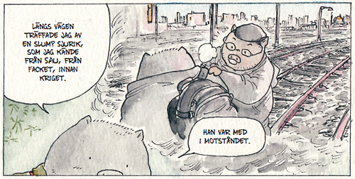
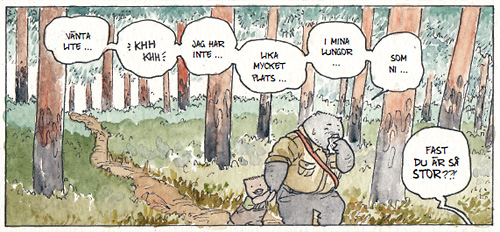
The story is set in the future, somewhere in what used to be Russia, after a great war that left everything poisoned. A small group of surviving piggies has built an Anarchist commune, growing food and recycling the remains of civilization, and we follow one day in the life of Organizational Secretary Andrei Lesnikov.
In the proposal I summarized it as “Hansu no kikan meets Yokohama kaidashi kikou, with an extra large serving of death-angst”, and thought that maybe it sounded a bit too whacked. But Ordbilder is using that exact phrase in their first promo for the book. Heh.
And now I actually have to draw it … V`(oo)´;V
It will be awesomepants to work in colour and especially to draw piggies.
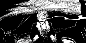
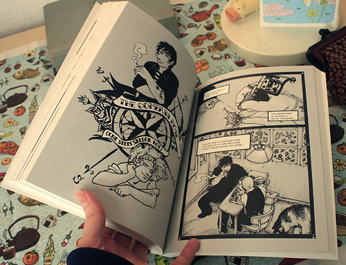
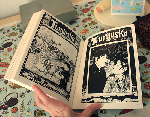
My beautiful books :3
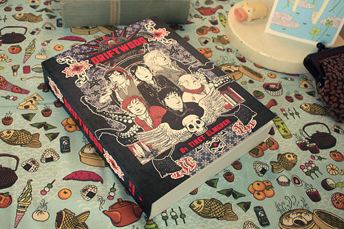
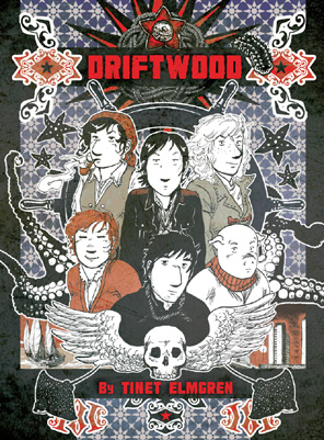
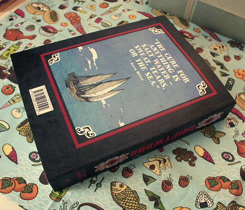
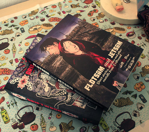
The Driftwood book is fantastic.
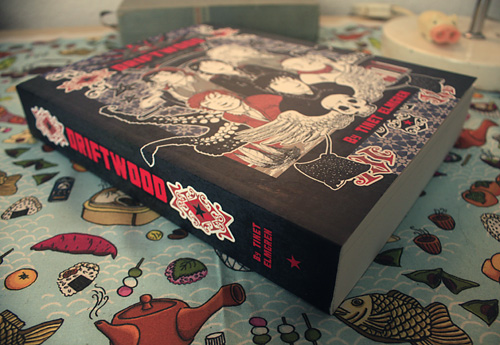
It’s 37 mm fat with all its 392 pages.
I originally wanted to print it on even thicker paper (150 g Munken Print White 15, instead of 115 g), but my printer said they couldn’t do it (for a reason not specified). Maybe with the thicker paper it would have been 5-6 cm thick? :3
So I suppose it’s just as well that I had it printed on 115 g paper in the end. There are no problems with the pages shining through on the other side anyways – something I was very worried about after my earlier test prints with the inferior Lulu books.
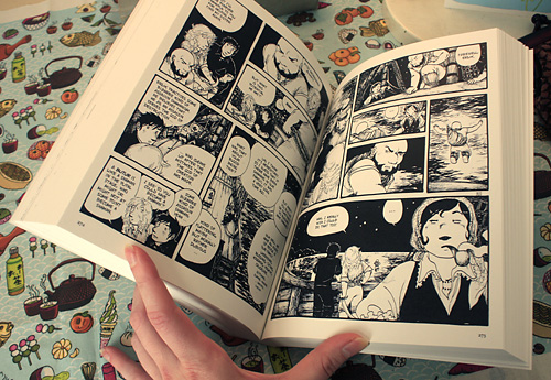
They are printed with digital printing, and the lineart looks really nice and deep black.
Yeah …
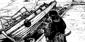
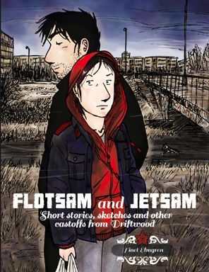
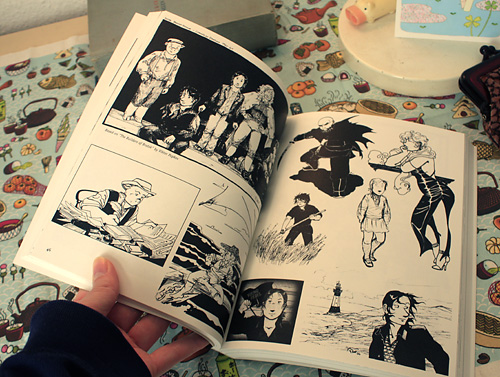
As I’ve observed at all the festivals so far where I’ve had these books for sale, the Flotsam and Jetsam book totally steals the show!
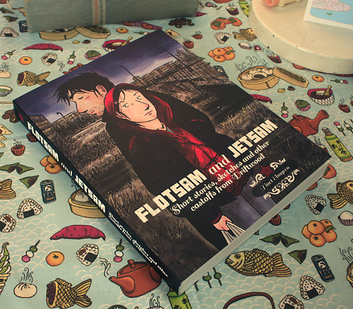
There’s just something about the cover illustration, I guess. (Here I’ve written about how it came to be.) Maybe if I print a second edition of the books I should switch the covers?!
It’s a bit frustrating that people almost always pick up Flotsam first, and then open it and probably think, “Oh, it’s not a comic”, and put it back and walk away without ever looking at the Driftwood book. I try to place it in an eyecatching but less pick-up-encouraging spot on the table (there’s a whole science in table arrangement of books/zines), and when people pick it up I may comment as inoffensively as possible that it’s a companion book to Driftwood (but I have to be careful because comics readers are very easily intimidated!).
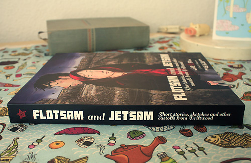
Of course, it’s such a beautiful book that I really can’t blame people for wanting to look at it. V^(oo)^V
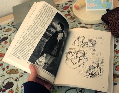
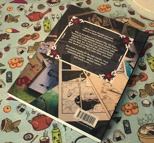
It’s “only” 212 pages, but filled to the brim with lots of fascinating facts about Driftwood and how it was created, as well as tons of illustrations, sketches and short stories, many never published before anywhere.
You can order the books from Amazon with the fastest shipping:
Driftwood – Flotsam and Jetsam
Or directly from me if you want to boycott Amazon (I might sneak in something extra or decorate the envelope with a piggy sticker or two):
Driftwood – Flotsam and Jetsam
If you want to inspect them in person first, you can already buy them at the comics library Renate.
* * *
P.S. The tablecloth is the fabric “japanese snacks!” by emuattacks, and by the lamp is a lovely piggy postcard by Ayumi Yoshikawa that I randomly found at Renate. V^(oo)^V